issue_comments
5 rows where issue = 292054887 sorted by updated_at descending
This data as json, CSV (advanced)
Suggested facets: created_at (date), updated_at (date)
issue 1
- Weird looking plots from combined DataArrays · 5 ✖
| id | html_url | issue_url | node_id | user | created_at | updated_at ▲ | author_association | body | reactions | performed_via_github_app | issue |
|---|---|---|---|---|---|---|---|---|---|---|---|
| 362089951 | https://github.com/pydata/xarray/issues/1862#issuecomment-362089951 | https://api.github.com/repos/pydata/xarray/issues/1862 | MDEyOklzc3VlQ29tbWVudDM2MjA4OTk1MQ== | gajomi 244887 | 2018-01-31T22:17:48Z | 2018-01-31T22:17:48Z | CONTRIBUTOR | A max_spacing argument sounds interesting, but definitely makes me think I need to meditate for awhile on the scope of raised issue. A basic semantic distinction of importance here is where the coordinates are "point like", or represent the centers of intervals of some volume or something else entirely (e.g., in the case of non-interval or float data). Depending on what they represent you might want to plot one thing or another. |
{
    "total_count": 0,
    "+1": 0,
    "-1": 0,
    "laugh": 0,
    "hooray": 0,
    "confused": 0,
    "heart": 0,
    "rocket": 0,
    "eyes": 0
} |
Weird looking plots from combined DataArrays 292054887 | |
| 361298500 | https://github.com/pydata/xarray/issues/1862#issuecomment-361298500 | https://api.github.com/repos/pydata/xarray/issues/1862 | MDEyOklzc3VlQ29tbWVudDM2MTI5ODUwMA== | shoyer 1217238 | 2018-01-29T16:18:49Z | 2018-01-29T16:18:49Z | MEMBER |
I'm not so sure it makes sense in 1D, either. Most of the time I've wished that large gaps were replaced with empty gaps. I've learned to be suspicious of long straight lines. One option would be to add a Potentially we could even default to some heuristic choice for I'm also not entirely sure how to implement |
{
    "total_count": 0,
    "+1": 0,
    "-1": 0,
    "laugh": 0,
    "hooray": 0,
    "confused": 0,
    "heart": 0,
    "rocket": 0,
    "eyes": 0
} |
Weird looking plots from combined DataArrays 292054887 | |
| 361198553 | https://github.com/pydata/xarray/issues/1862#issuecomment-361198553 | https://api.github.com/repos/pydata/xarray/issues/1862 | MDEyOklzc3VlQ29tbWVudDM2MTE5ODU1Mw== | fmaussion 10050469 | 2018-01-29T10:11:21Z | 2018-01-29T10:44:55Z | MEMBER | Note that this is related to https://github.com/pydata/xarray/issues/1852 . xarray 2d graphics currently make assumptions about the coordinates (monotonically ascending / descending, more or less -but not strictly- evenly spaced), which are very sensible in the geosciences but which become less true when the data becomes messy as in these two cases. Here again I think that it will be hard to find a generic solution which will work same for all 2d graphics (contourf, imshow and pcolormesh), but I would be happy for any suggestion you have. At the very least we should raise an error or warning (similar to https://github.com/pydata/xarray/issues/1852) |
{
    "total_count": 0,
    "+1": 0,
    "-1": 0,
    "laugh": 0,
    "hooray": 0,
    "confused": 0,
    "heart": 0,
    "rocket": 0,
    "eyes": 0
} |
Weird looking plots from combined DataArrays 292054887 | |
| 361111273 | https://github.com/pydata/xarray/issues/1862#issuecomment-361111273 | https://api.github.com/repos/pydata/xarray/issues/1862 | MDEyOklzc3VlQ29tbWVudDM2MTExMTI3Mw== | gajomi 244887 | 2018-01-29T00:32:32Z | 2018-01-29T00:33:35Z | CONTRIBUTOR |
I guess I had imagined it would not try to plot those intermediate values. I think the behavior makes sense in 1d (pandas does the same linear interpolation I think)
👍 I'd be happy to take a stab at implementing plotting that gives (by default or through an optional argument) a result equivalent to the last plot you made if you imagine xarray users would find it useful. |
{
    "total_count": 0,
    "+1": 0,
    "-1": 0,
    "laugh": 0,
    "hooray": 0,
    "confused": 0,
    "heart": 0,
    "rocket": 0,
    "eyes": 0
} |
Weird looking plots from combined DataArrays 292054887 | |
| 360939678 | https://github.com/pydata/xarray/issues/1862#issuecomment-360939678 | https://api.github.com/repos/pydata/xarray/issues/1862 | MDEyOklzc3VlQ29tbWVudDM2MDkzOTY3OA== | shoyer 1217238 | 2018-01-27T00:09:48Z | 2018-01-27T00:09:48Z | MEMBER | I'm not 100% sure if we're doing the right thing here or not :). The fundamental issue here is that your coordinates are not evenly spaced: ```
Notice the jump from 15 to 48. Without coordinate values in between, what should xarray assume for the intermediate values? Here we seem to be treating the function as piece-wise constant. Probably the simplest way to fix this is to start with an all NaN array of the appropriate size. This yields a sensible looking plot:
|
{
    "total_count": 0,
    "+1": 0,
    "-1": 0,
    "laugh": 0,
    "hooray": 0,
    "confused": 0,
    "heart": 0,
    "rocket": 0,
    "eyes": 0
} |
Weird looking plots from combined DataArrays 292054887 |
 but in 2d it seems weird. Is there are common use case where this interpolation is desirable? Perhaps its just my ignorance speaking, but it feels like the behavior violates the principle of least astonishment, especially in light of the fact that irregular grids are one of the main use cases for xarray with explicit support in the
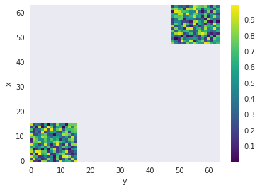
Advanced export
JSON shape: default, array, newline-delimited, object
CREATE TABLE [issue_comments] (
   [html_url] TEXT,
   [issue_url] TEXT,
   [id] INTEGER PRIMARY KEY,
   [node_id] TEXT,
   [user] INTEGER REFERENCES [users]([id]),
   [created_at] TEXT,
   [updated_at] TEXT,
   [author_association] TEXT,
   [body] TEXT,
   [reactions] TEXT,
   [performed_via_github_app] TEXT,
   [issue] INTEGER REFERENCES [issues]([id])
);
CREATE INDEX [idx_issue_comments_issue]
    ON [issue_comments] ([issue]);
CREATE INDEX [idx_issue_comments_user]
    ON [issue_comments] ([user]);
user 3